
Evolution of a Logo and the Rolling Rogans
- Amy Rogan

- May 20, 2021
- 4 min read

We are immensely proud to officially release our new logo! Joe likes to give me credit for it (which I’ll happily take.) But it was truly a joint effort. I came up with the initial concept on a whiteboard in the van, then worked up the first design in Adobe Illustrator. Then Joe got a hold of it with Procreate and Illustrator. We both liked the shape of the Rs he came up with so then it bounced back to me to clean up and engineer it to symmetry. Add a dash of our friend Nat Silver to critique and suggest the perfect final touches with her fine art eye. TA-DA! Pure awesomeness.
Personal branding is important these days with social media, entrepreneurship, and business. We’ve always enjoyed branding ourselves and others. Thanks to Facebook shutting down our old Rolling Rogans account, it prompted us to evolve and grow even more. We took this discouraging challenge to step back, reflect, and grow.
Inspiration is all around us. You can’t help but be influenced by the amazingly creative work out there. As Joe and I design logos, brands, and graphics, we are heavily influenced by the success of other brands. What works for them and also what resonates for the client and consumer. The beginning of our logo came from our big thinking and financial goals. Joe was inspired by the beauty and design of the Rolls Royce logo and products. Rolling Rogans just rolled out as a natural name for us. We had been called road warriors, rolling along for our businesses. We love the minimalist tiny living, the simplicity, and the freedom we have, but we also love luxury and beautifully designed things. I’ve always had a champaign taste on a beer budget. I am just as happy in our #TinyHomeOnWheels as I am at a 5-star resort. We can appreciate the beauty on both ends of that spectrum. There is no reason we have to decide to be one way or the other. Experience all life has to offer!

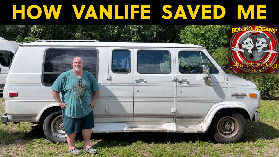
The only place left of our Rolls Royce inspired original logo is currently on the side of our van. It was a starting point, the beginning of our latest journey. This logo will probably be removed soon as we evolve our urban camouflage for stealth camping. However, we have been able to hang out comfortably in some incredible neighborhoods because of it! LOL Of course, we began to have a little trouble with using that logo on social media. Even though we did change many aspects of it, it was still too close to the original inspiration of Rolls Royce.
So we changed it fairly early on in our personal branding journey. Change and growth are good. We kept the altered but similar Rolls Royce Rs and italicized them, putting them in red circles. The forward movement of the italicized Rs fit nicely with our rolling feeling and momentum. The RRs were still recognizable as Rolls Royce to many people though.

After having that logo for at least a year, it was getting time to change it. We still don’t know for sure why Facebook shut down our first Rolling Rogans page but just in case it was based on logo infringement this was the nudge we needed to revisit and evolve to something that was more uniquely us. During the 2020 pandemic, we personally grew and changed as well. We found clarity in our personal core values and message.

What does this new logo mean to me? It means balance, strength together and as individuals, and rolling movement.
You can see the Rs share the center straight core. Joe and I are one. We come from one core strength together as a couple. However, there are still 2 individual Rs, we are still our own individual people. The Rs are also mirrored and reflected like a yin yang. Seemingly opposite or contrary forces actually being complementary, interconnected, and interdependent. Just as Joe and I mirror and reflect each other’s strengths and weaknesses. We do not hide these from each other anymore but work through them together to help the other grow. The Rs are also perfectly balanced and intertwined in the positive and negative space. Balance has become a very important core value for us. Physical, mental, and emotional balance is important to live a rich and healthy adventurous life. Harmony is said to exist when the opposing forces are equally balanced. We want to inspire others to find their balance as well, within themselves and in the relationships they have. The logo looks the same up-side-down or right-side-up, either way, we are our authentic selves. There is no point in hiding something because of what people might think about you. Being transparent will inspire and help many more people. There is also an infinity loop within the Rs. We are limitless both in our lives and love for each other. I thought my life was limited to pain and suffering for a very long time. Joe has shown me life is an adventure that we can create with unlimited possibilities. You just have to keep on rolling. That leads to the circles. The inner circle is like the wheels on our van that take us to so many beautiful places. The outer circle represents the best things in life that are just outside of your comfort zone. Lastly, the red color came from the original Rolls Royce logo. (Check out here why their logo changed from red to black.) We tweaked our shade of red to be a little richer in color. Red symbolizes Action, Strength, Energy, and Passion. Its effects are Stimulating and Motivating with Courage and Confidence. All things we believe are important to living a successful life, whatever that definition of success means to you.
Our new logo is pretty, powerful, and bold! But now you know where this new look comes from. It comes from who we are. It comes from rolling through the mud, potholes, and side streets as well as around the beautiful mountain top views of life. This new look will carry us forward after this latest health challenge. These challenges have always been a launching point to take us to a new level of what we call success. Thank you for rolling with us as we evolve and grow.


Comments